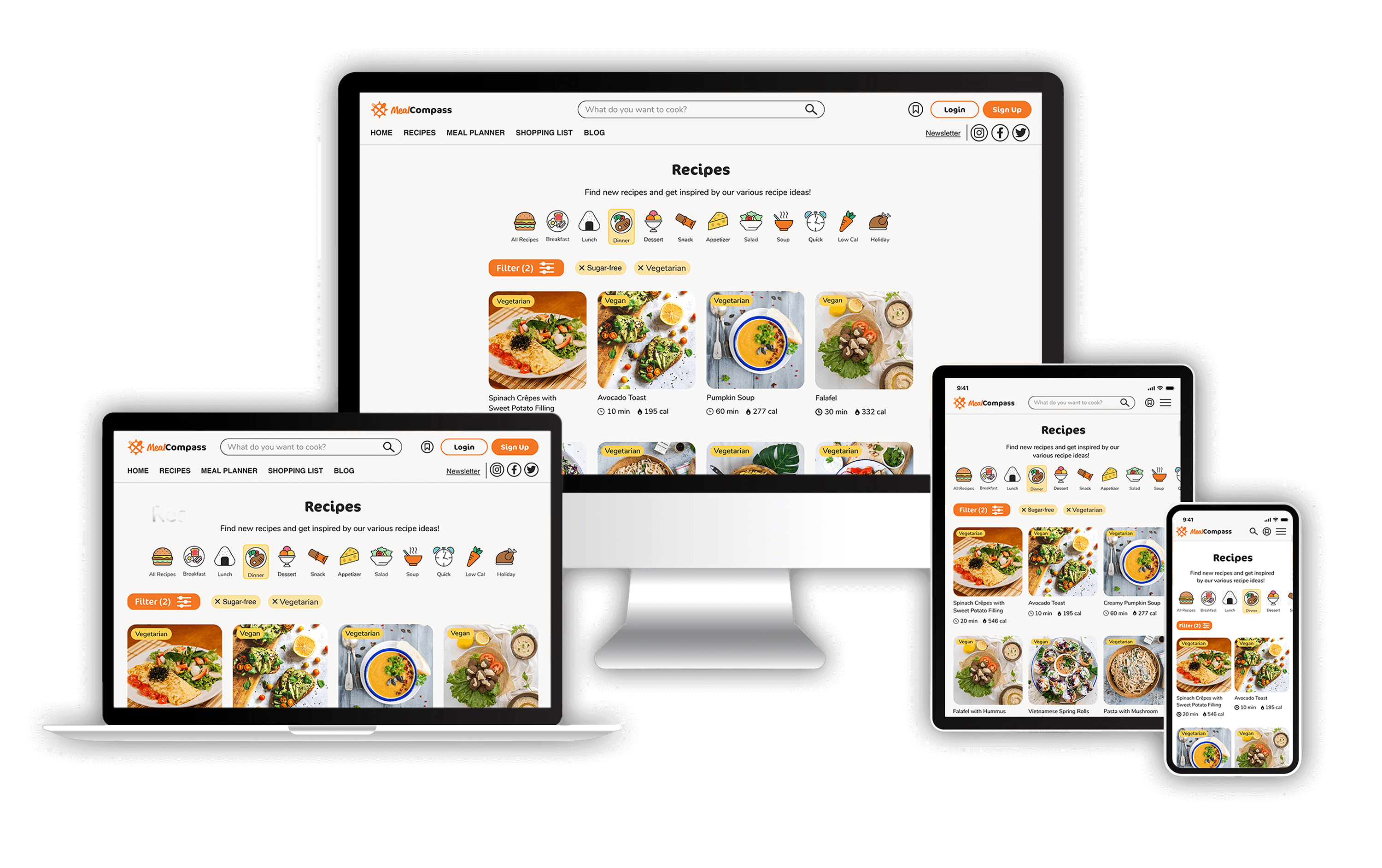
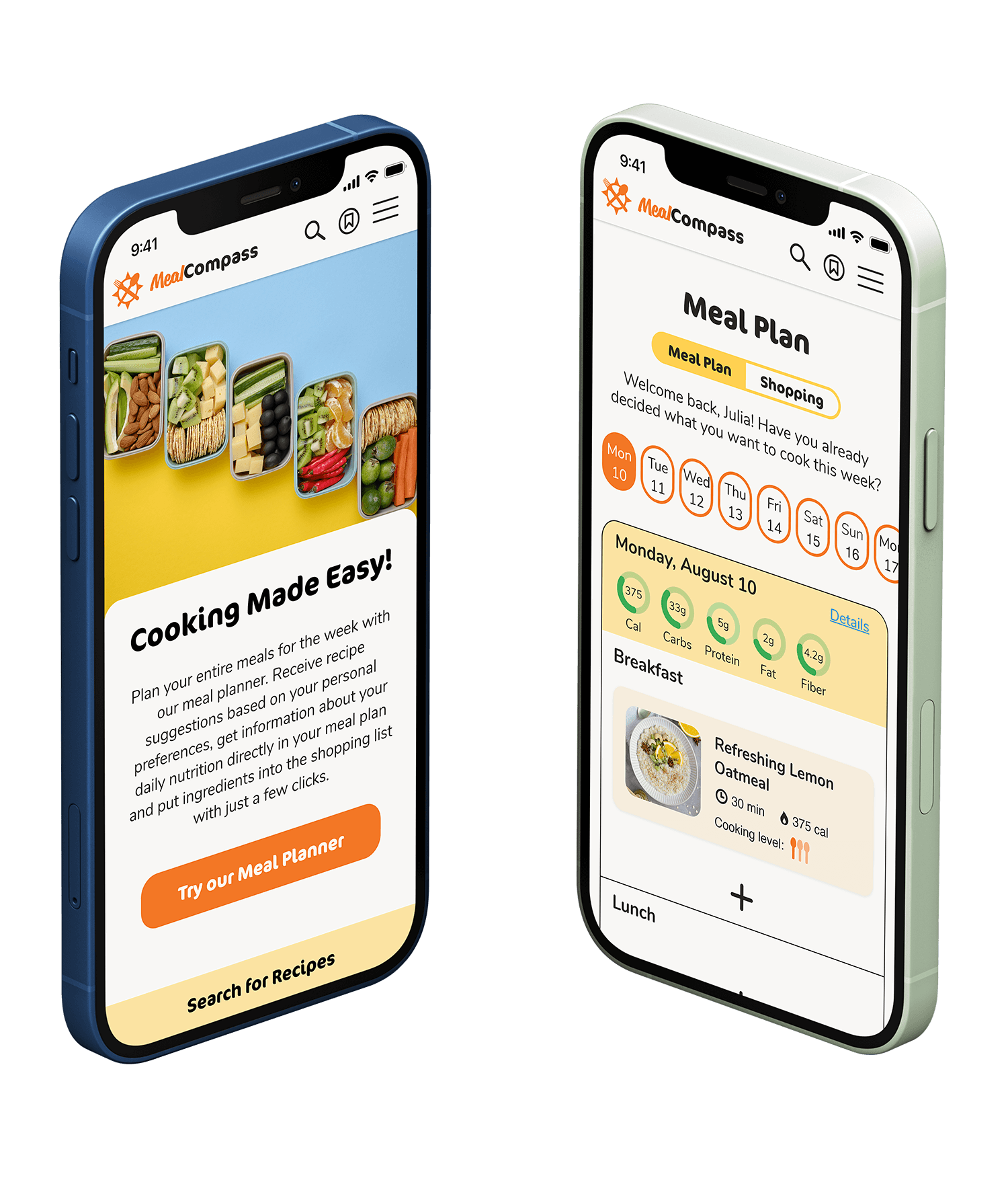
Plan your meals for the week ahead and make cooking a stress-freeandfun experience
Project Overview
Background
Managing a busy schedule and maintaining a healthy diet can be stressful and challenging. It can be quite daunting and overwhelming to scroll through a variety of recipes and decide what to cook, especially when there are numerous other tasks on our to-do list. All too often, a nutritious diet is one of the first things we neglect in our busy everyday lives.
Solution
To minimize friction and save valuable time, users require a method to swiftly decide on their meal plan without spending excessive time browsing through numerous recipes. Consequently, it would be advantageous if the app could offer recipe suggestions aligned with the user's preferences. Furthermore, the option to directly transfer ingredients from the meal planner to a shopping list can alleviate potential stressors and transform cooking into a enjoyable and rewarding experience.
Defining the User: From Research to Persona
Who am I designing for? Defining the initial user base
Before diving directly into the app design, I aimed to understand WHO the user was I am designing for in the first place. What are the users' goals? Do they experience any pain points or frustrations that I could address? When would users utilize the product? To gain a clearer perspective of the target audience, I first began to define objectives.
Who?
People with a busy schedule that want to save time but are also aware of a nutritious and healthy diet.
What?
Plan meals and grocery shopping ahead, keep an eye on their nutrition, adjust filter options to their personal needs and follow recipes to cook meals.
Where?
Mostly at home / in the kitchen. They might use it on their desktop as well as on their mobile device.
When?
When planning meals and while cooking.
Why?
To save time on their meal planning and grocery shopping list creation.
How?
Users will search for recipes by filtering them according to their personal needs. They will decide a meal plan beforehand by putting recipes in a “calendar” and decide about ingredients that have to be bought based on these recipes.
Conducting user interviews: Uncovering user needs and pain points
The objectives helped me with better defining the target audience and identifying suitable participants for user interviews, enabling me to gather more meaningful insights for the project. The interviews helped to unveil the frustrations and goals of my users, further shaping the idea and direction of the project.
Frustrations
- Difficulty to find new and innovative recipes
- Difficulty to meet dietary needs or taste of all family members
Goals
- Better balanced meals
- Meeting dietary needs of all family members
- Better compatibility of busy lifestyle and diet
- Planning meals 1 week ahead
Giving the user an identity: Persona creation
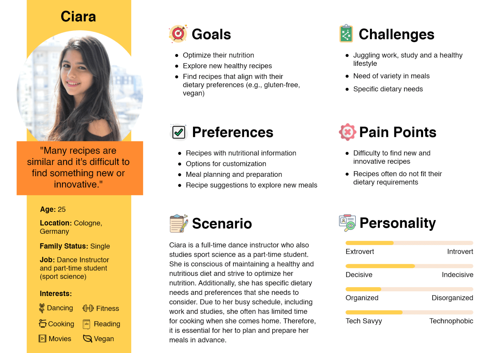
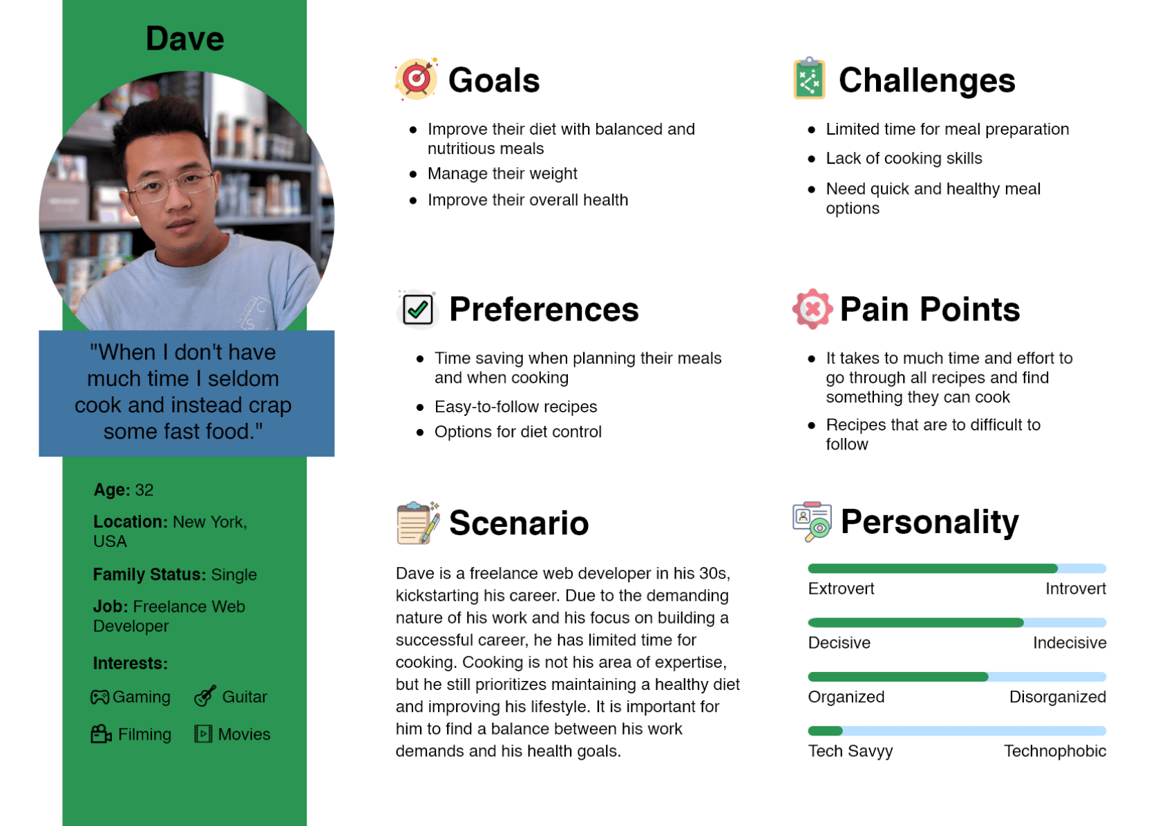
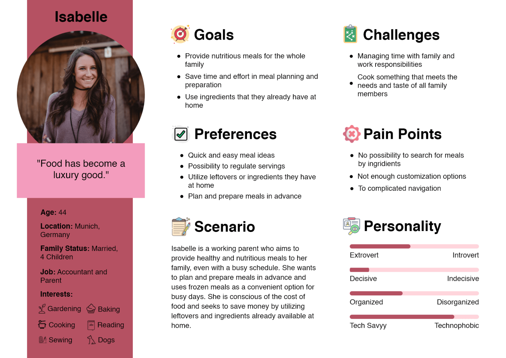
Drawing from the insights I acquired during user interviews, I crafted three distinct User Personas. These personas helped me to gain a more defined understanding of the target audience. Continuously keeping these personas in mind enabled me to make conscientious design decisions and develop a product that resonates with user needs, rather than relying solely on my broad assumptions of the user's preferences or personal biases.
Working out the requirements: How to make the product successful
Defining the Most Valuable Product (MVP)
Upon creating the Personas, I understood who the user was, but which functionalities could effectively solve the user's problems and align with their needs and goals. With my Personas at hand, I began formulating User Stories to gain a deeper understanding of their needs and what they were looking for in a recipe web app.
After iterating and generating an array of features and functionalities (while reminding myself that not every potential feature I could integrate into the app necessarily enhances the user experience), I started to categorize each as either a 'nice-to-have' or 'crucial' functionality. Afterwards I gathered all this information into an MVP document, which would indicate the initial direction of the product design.
MVP Objective:
- To provide an overview about nutritional information to reduce frictions for a healthy diet despite a busy schedule.
- To offer busy individuals a way to plan their meals without much effort and according to their needs and preferences.
Hypothesis:
A healthy and nutritious diet and a busy schedule are not always easy to manage. When there is to much friction to cook healthy meals, such as deciding for a recipe, organize their grocery shopping or planning in advance, people are more likely to choose an unhealthy but fast option. Therefore, the web app aims to accommodate busy people with their meal planning and a healthy diet.
Success Metrics:
- Number of user profiles
- Number of newly created user profiles
- Number of meal plans that have been created
- SEO Ranking
- Reviews from users
User Stories
Defining the structure of the web app
User Flow: Designing the navigation of the web app
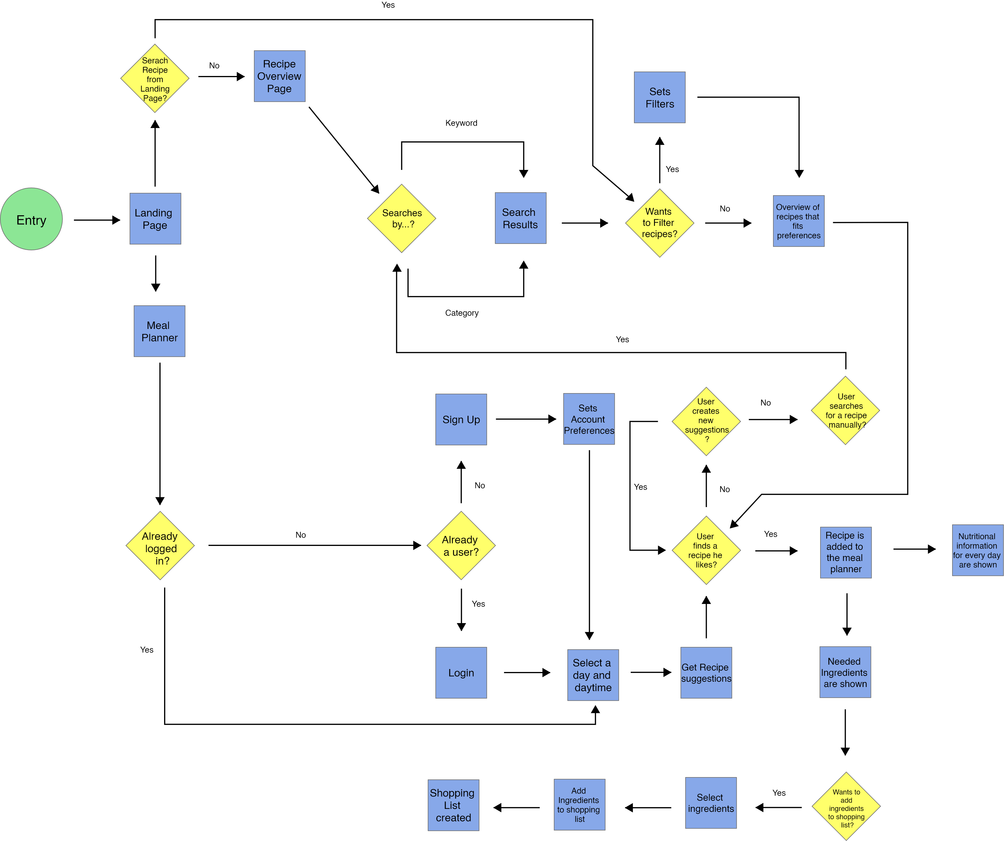
Following the MVP, I began outlining the user flow based on the JTBD. The User Flow illustrated the path users would follow to navigate through different screens, highlighting decision points that would impact their progression within the app and the specific screens they would encounter.
Start/End
Screen
Decision
First iterations of the screens: Designing the low-fidelity wireframes
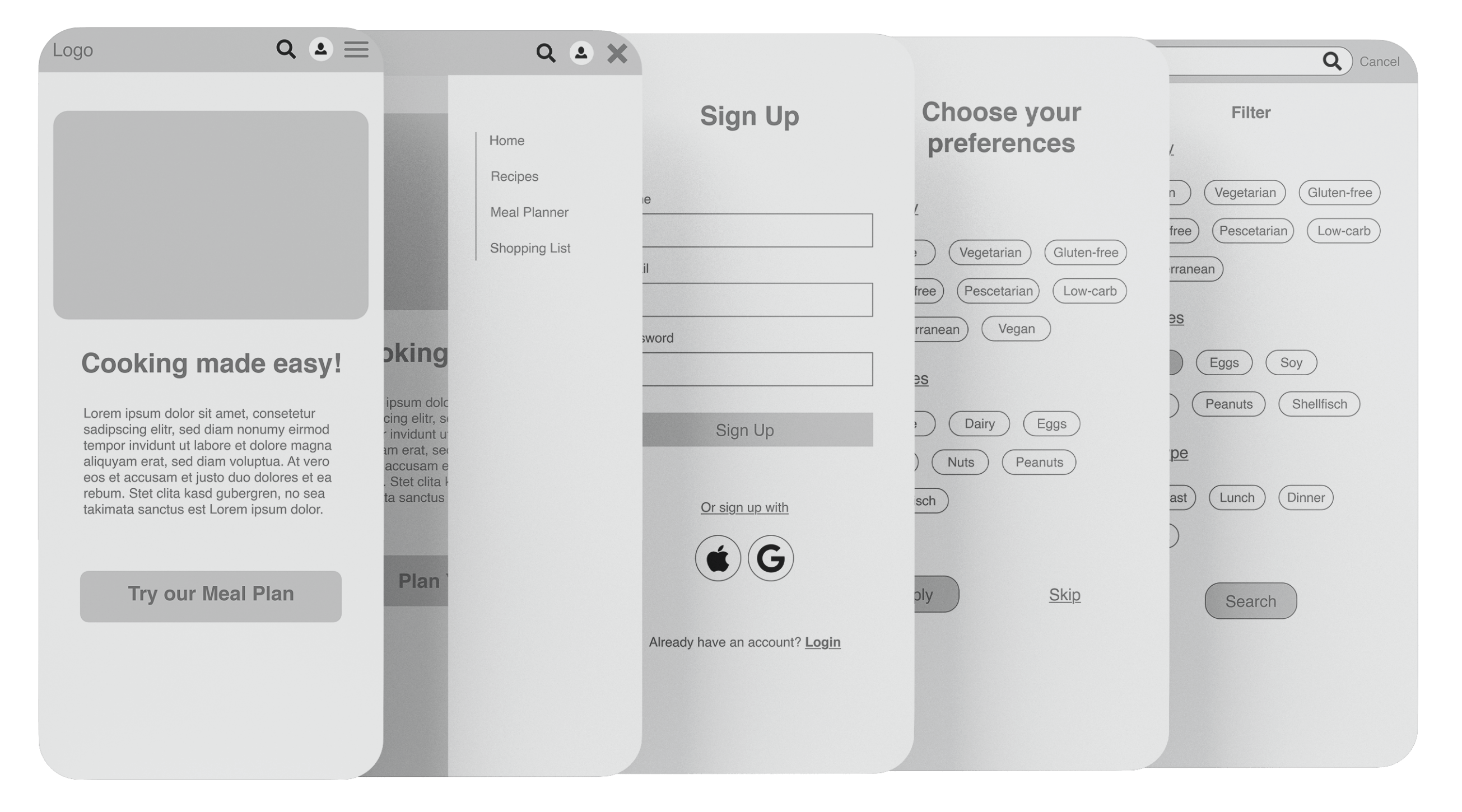
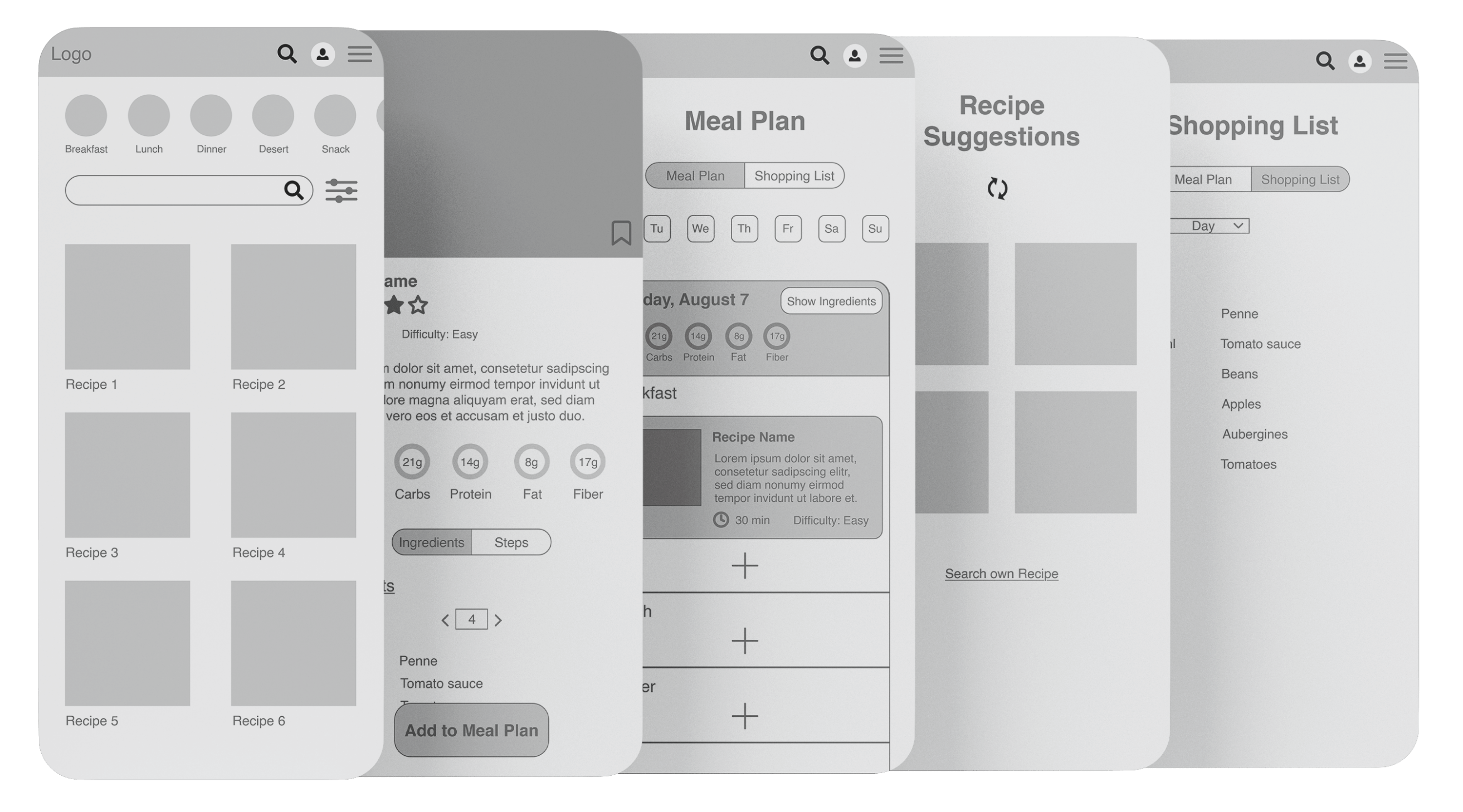
The User Flow helped me with obtaining a clear understanding of the screens and functionalities that needed to be designed and so I started iterating on how the app's actual screens and navigation would be structured. After multiple iterations, including a series of 'crazy8's', I ultimately crafted my Low-Fidelity Wireframes, which served as the fundamental basis for the screen layout.
Refining the screens: From Usability Testing to High-Fidelity Wirefrmaes
Testing the design and solving usability Problems
To assess the usability of the app's navigation and overall design, I developed a simple prototype based on my Low-Fidelity Wireframes. I recruited three participants and assigned them five tasks to complete, aiming to identify any significant pain points or difficulties that could affect the navigation. Although the testers encountered no major issues while navigating the app and completing the tasks, I identified some points that I intended to address in my iteration for the Mid-Fidelity Wireframes, with the goal of enhancing the overall user experience.
Problem 1
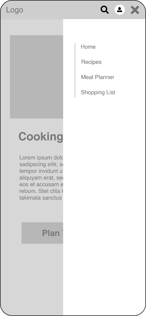
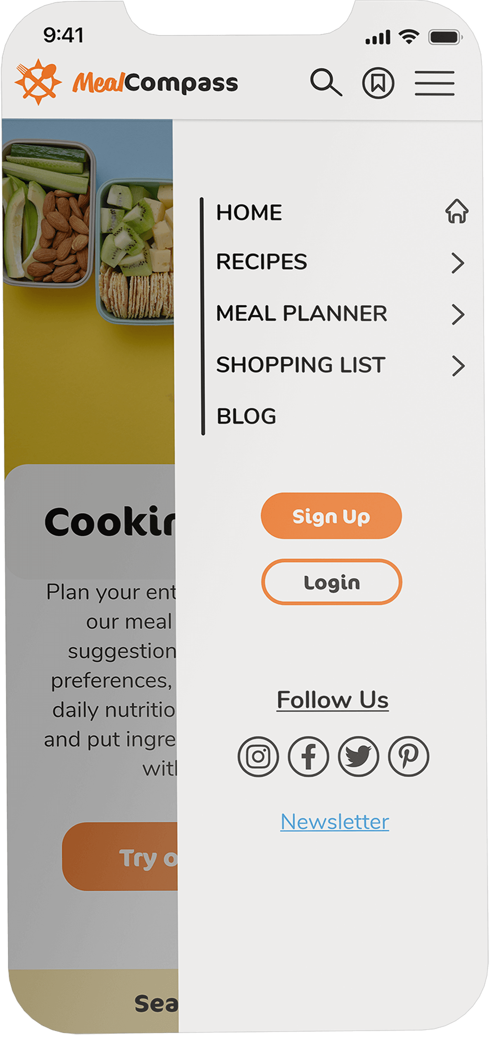
In my initial wireframes, the only option to sign up for the recipe website was accessible through the profile icon. During testing, one participant expressed confusion as she expected to find the sign-up option within the hamburger menu.
Although she eventually located the sign-up option via the icon, the delay in finding the sign-up option could potentially discourage users from signing up initially. Consequently, I identified this usability issue as a significant problem that requires attention and should be addressed.
Solution 1
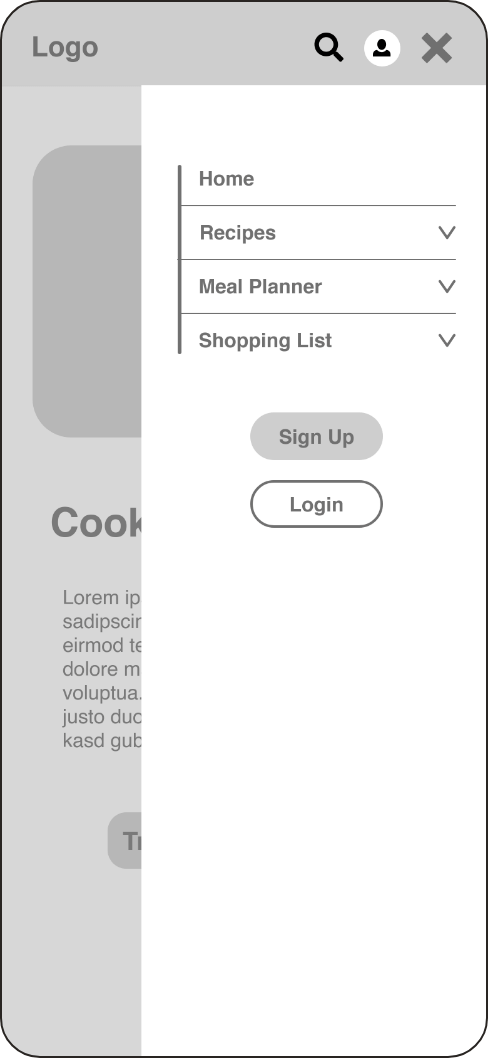
To resolve the issue, I added sign-up and log-in buttons to the hamburger menu.
Problem 2
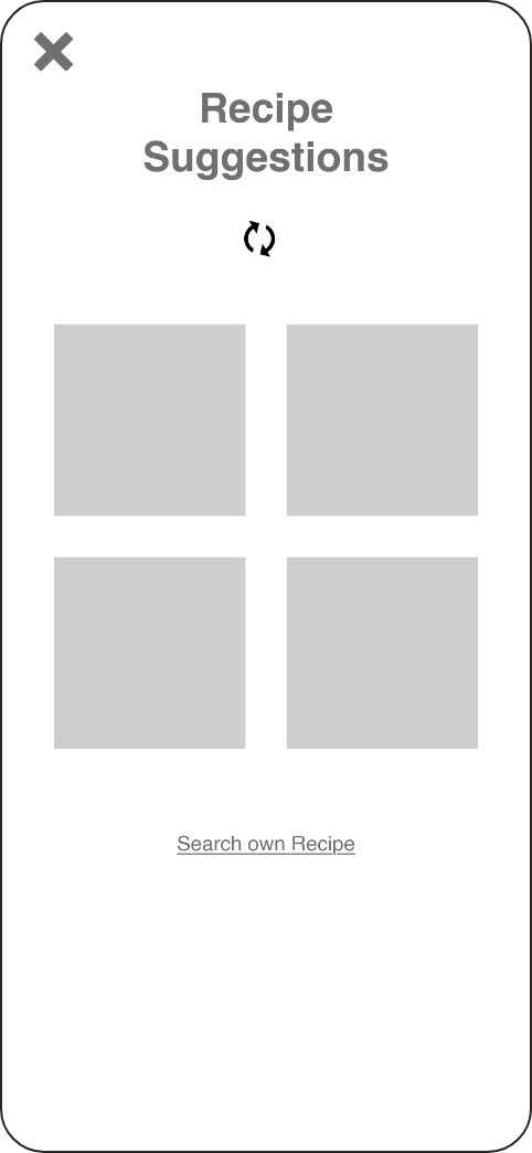
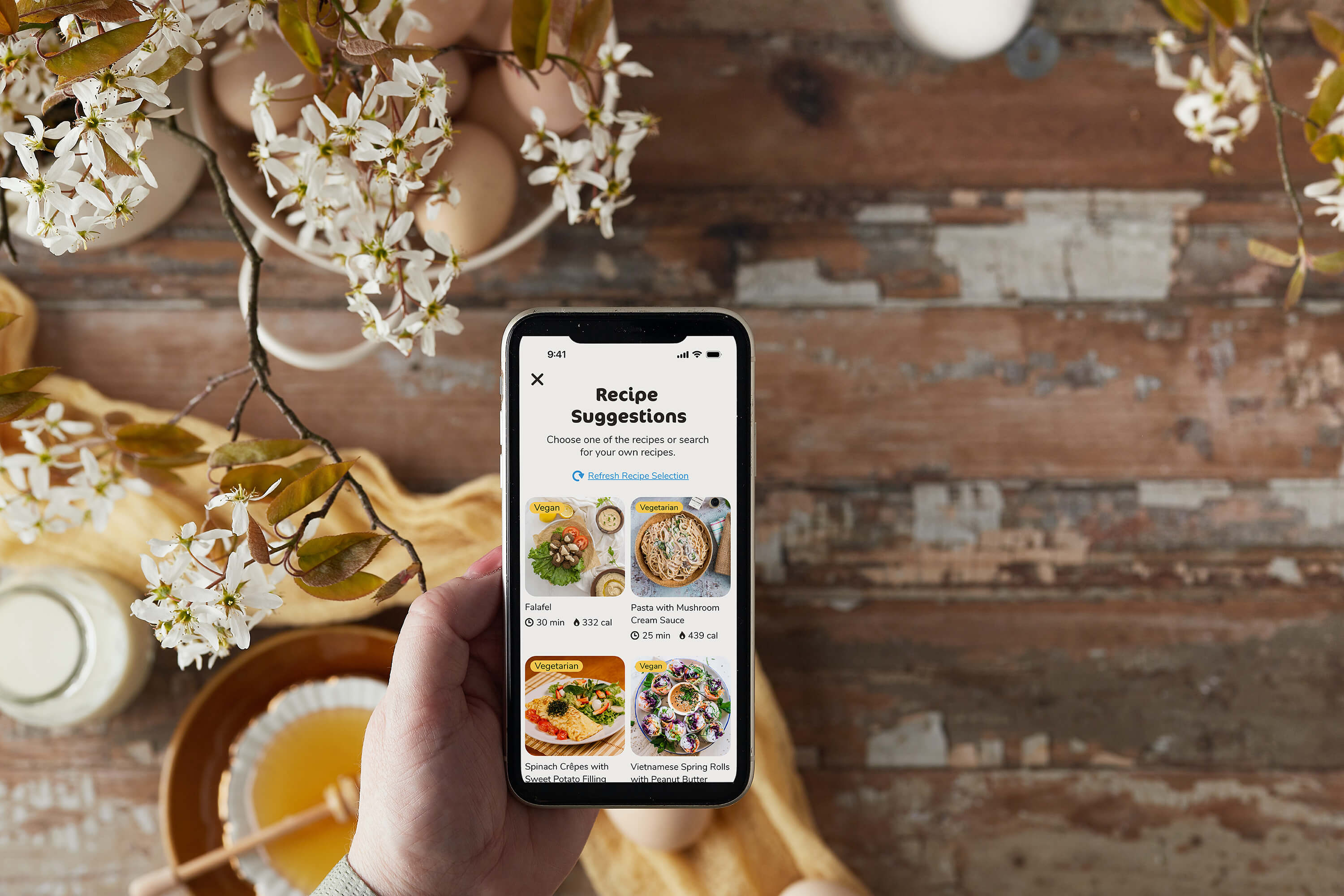
The recipe suggestions screen was too minimal and lacked an explanation for users regarding its purpose or what actions they should take on this page.
Solution 2
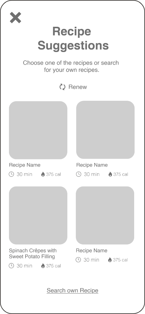
To address this issue, I included a description at the top of the page and added recipe details to each item, providing users with a clearer understanding of the page's purpose.
Problem 3
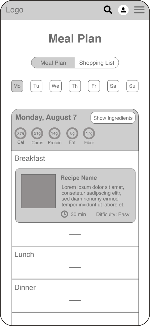
The button to add ingredients from the meal planner to the shopping list said "show ingredients" which didn't convey it's purpose to some of the testers. As it is a crucial functionality of the app, it was a significant usability problem if users found it challenging to add ingredients to the shopping list.
Solution 3
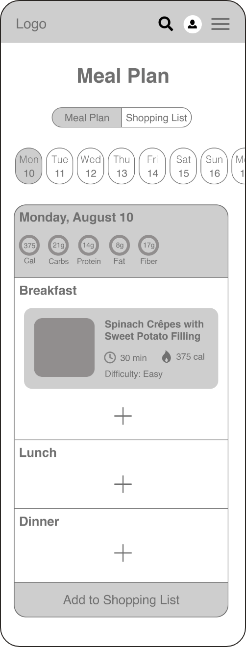
To tackle this usability issue, I adjusted the button's position and made it bigger, making it easier for users to locate. Additionally, I revised the text to 'Add to Shopping List' for a clearer button description.
The style guide: Adding personality to the design
While the Wireframes offered the foundational structure of the recipe app, it's unlikely anyone would engage with an app solely in grayscale. Thus, I shifted my focus towards refining the app's appearance and style. I selected colors and typography that harmonize with the app's positive and cheerful atmosphere, ensuring users feel welcomed each time they launch the app. Additionally, I crafted icons and a logo to further enhance the visual appeal.
Colors
Typography
CoconPro
Headings & Buttons
Nunito
Sub-Headings & Paragraphs
Icons
All Recipes
Breakfast
Lunch
Dinner
Dessert
Snack
Appetizer
Salad
Soup
Quick
Low Cal
Holiday
Logo
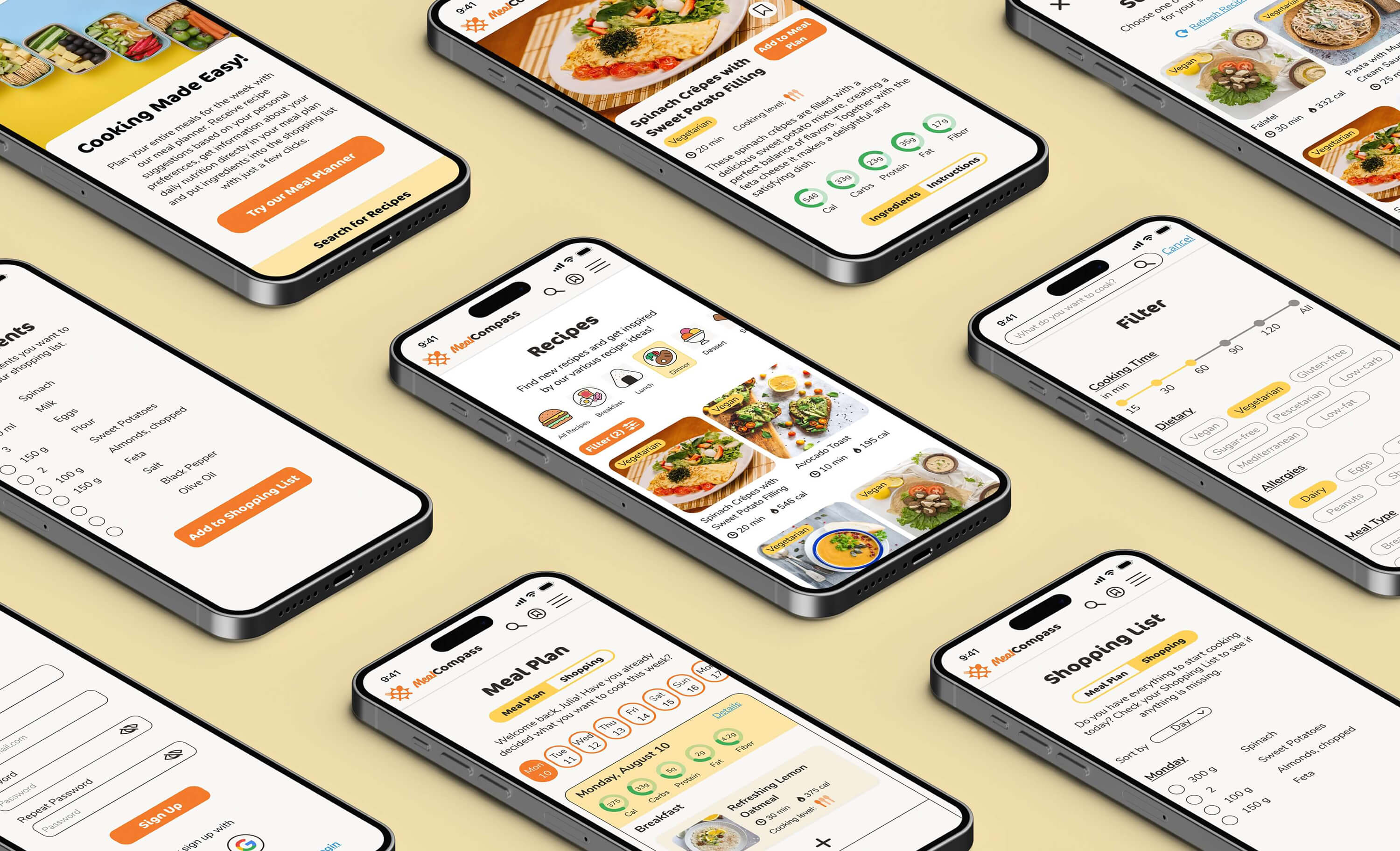
The final design and functionalities
Following the application of the styles I outlined in the Style Guide, I went on to incorporate them into my wireframes. However, since the visual style represents only one facet of crafting a successful product, let's also examine how I implemented the functionalities I previously defined and how I harmonized both the UX and the UI design.
Set your Preferences
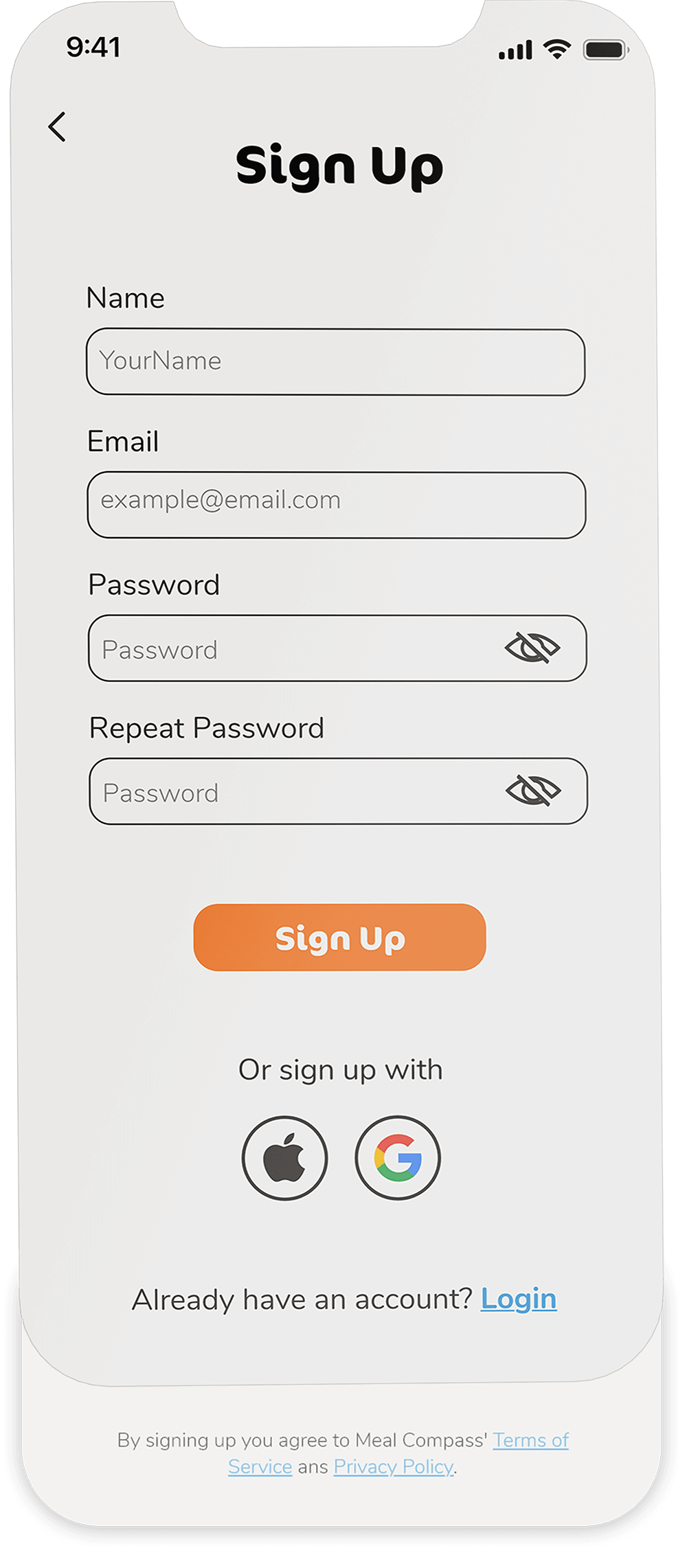
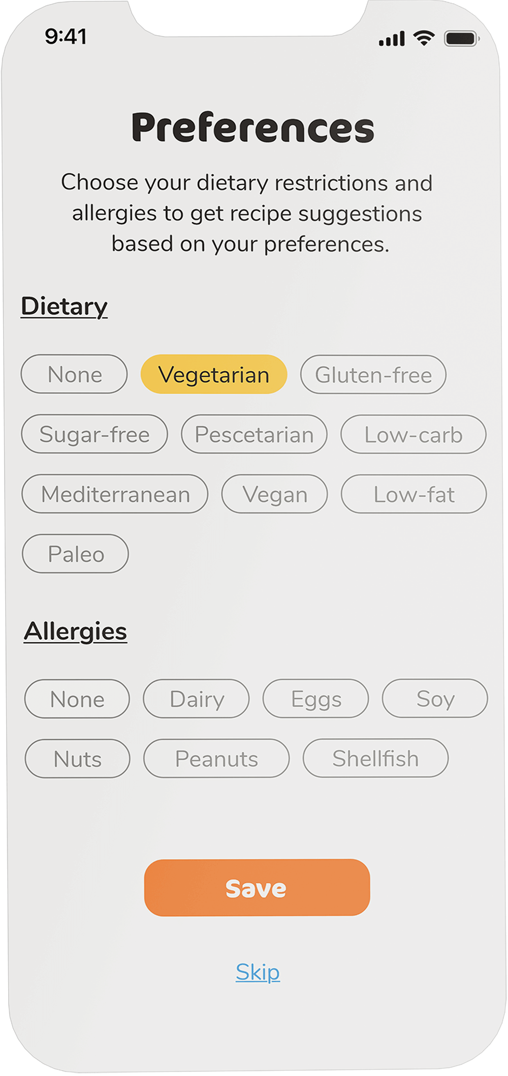
Save your dietary preferences and allergies in your profile to receive personalized and pre-selected filtering options or recipe suggestions aligned with your preferences.
Search for Recipes

Select from a range of filtering options to discover recipes that match your requirements.
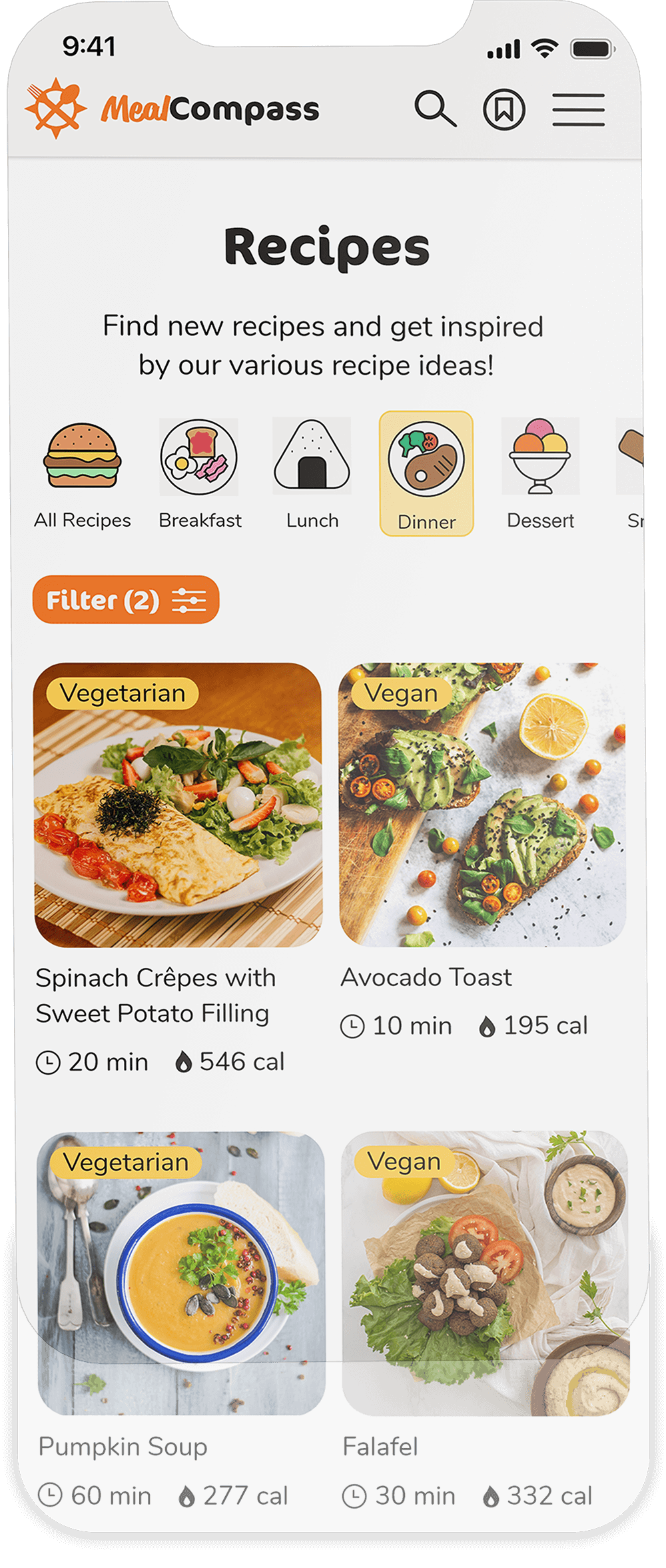
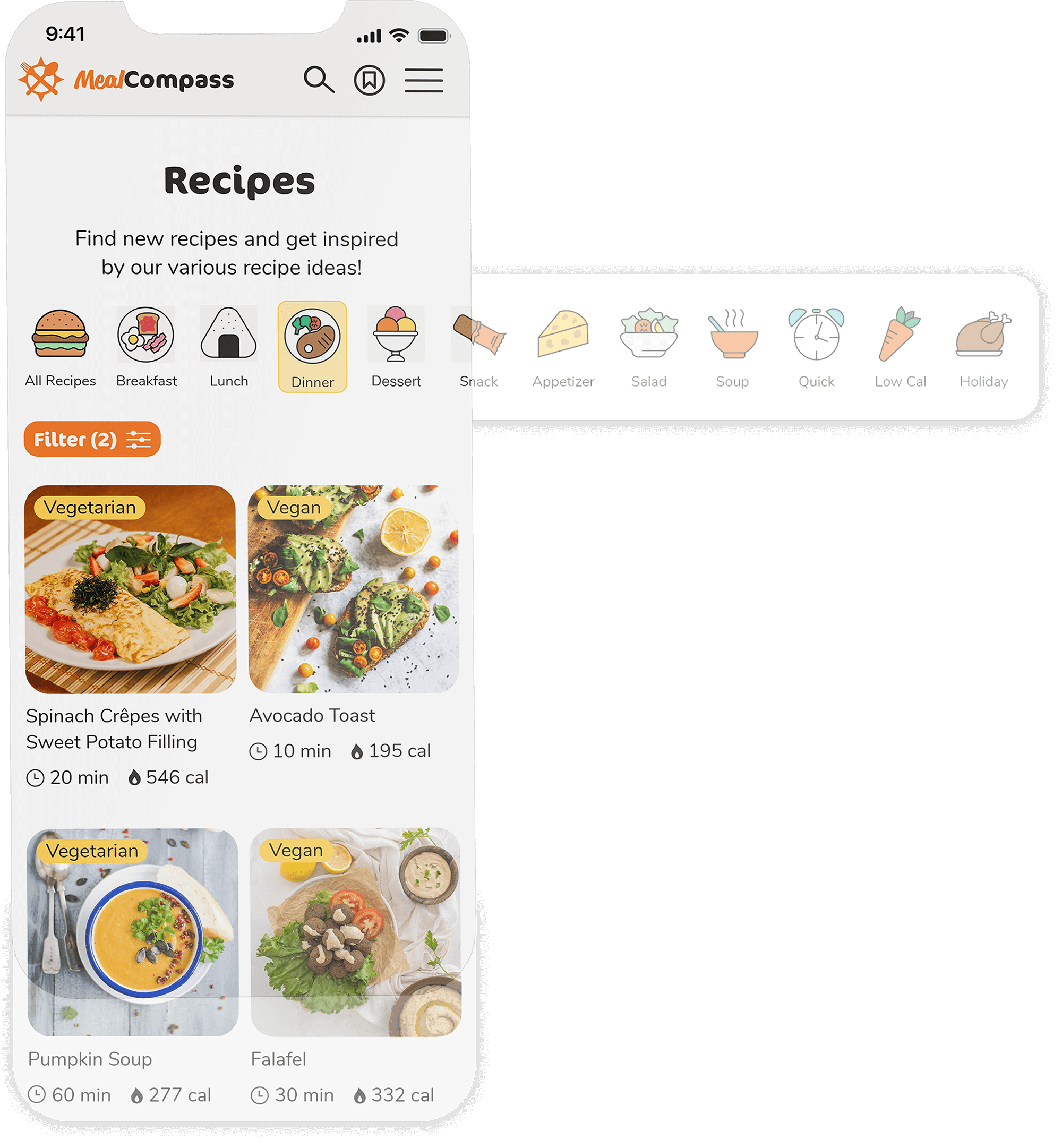
Discover fresh cooking inspiration by selecting a recipe from our diverse range of culinary ideas.

Effortlessly switch between Ingredients and Cooking Instructions without the need to continuously scroll up and down.

Plan your Meals
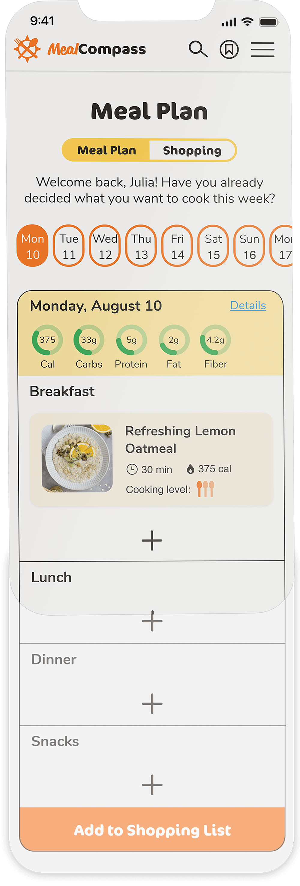
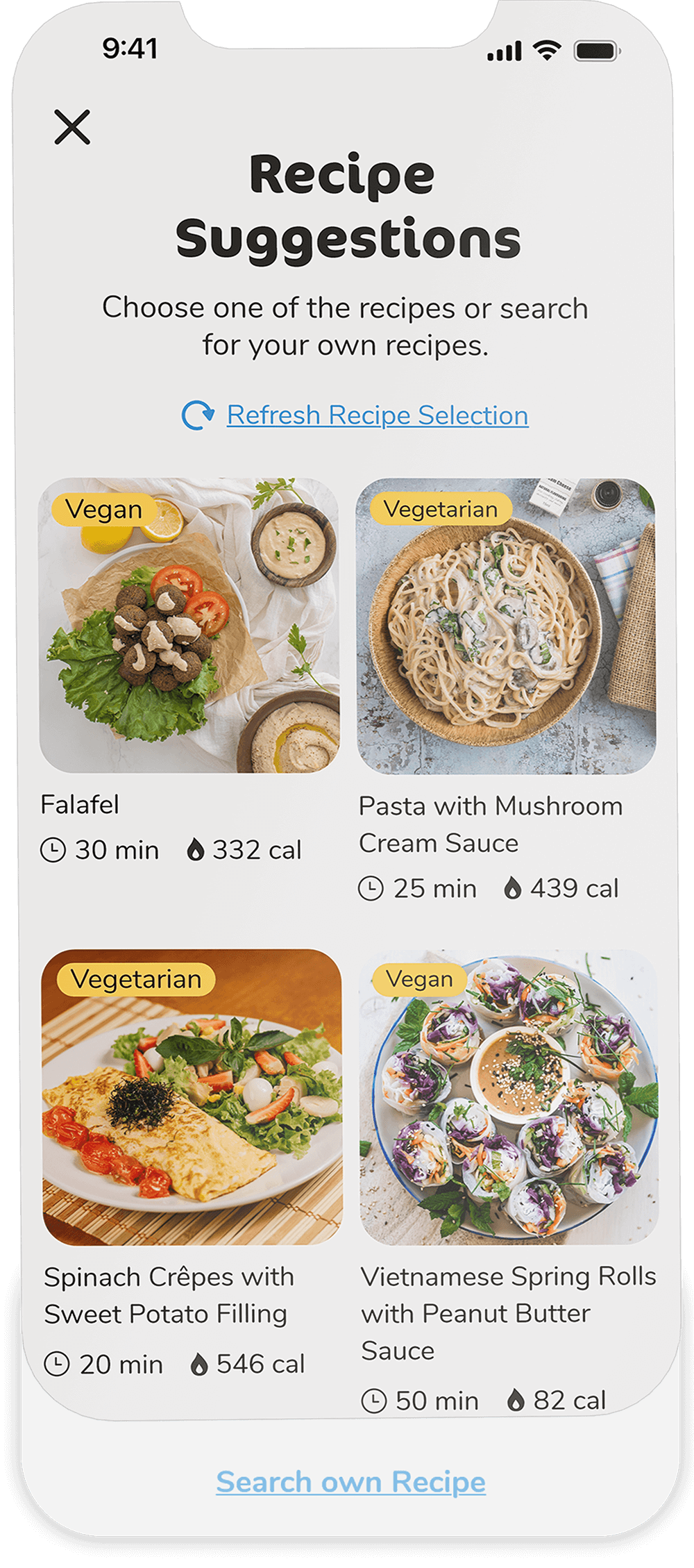
Plan your weekly meals and receive personalized recipe suggestions to save time and effort.

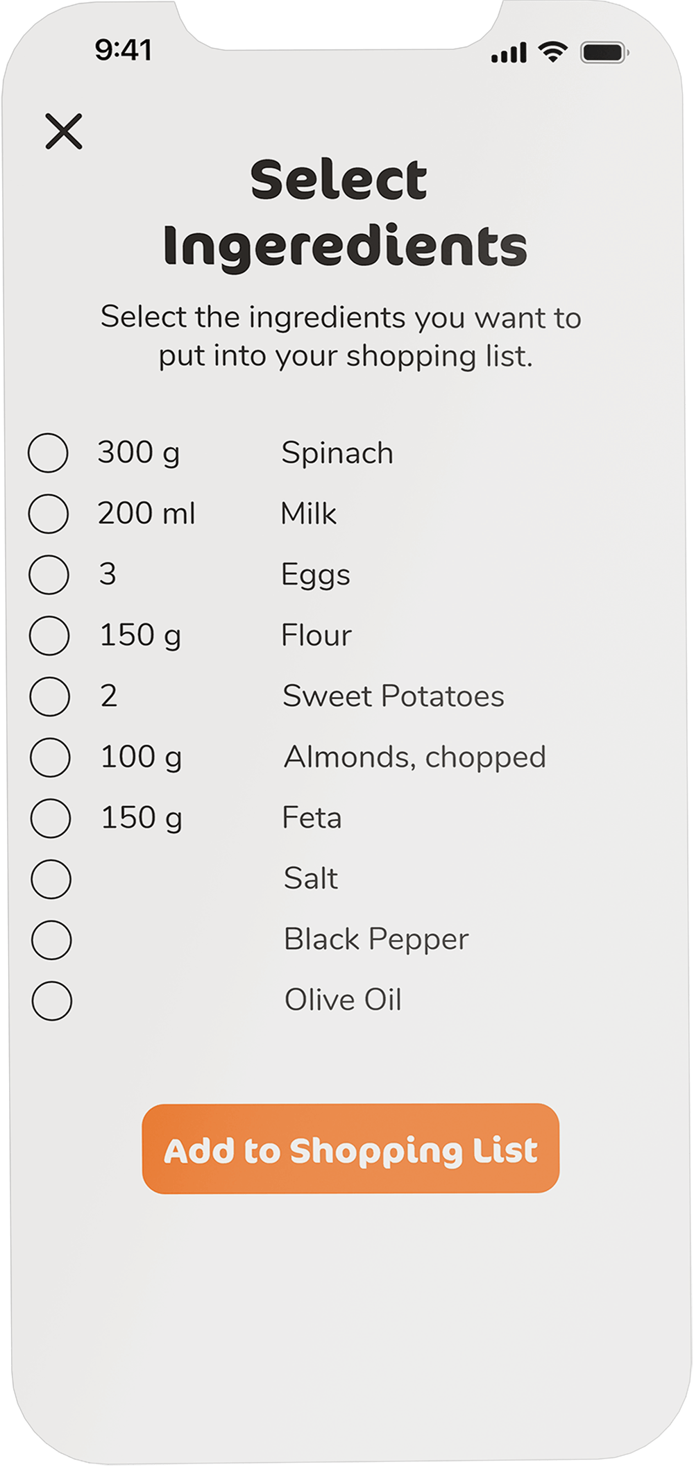
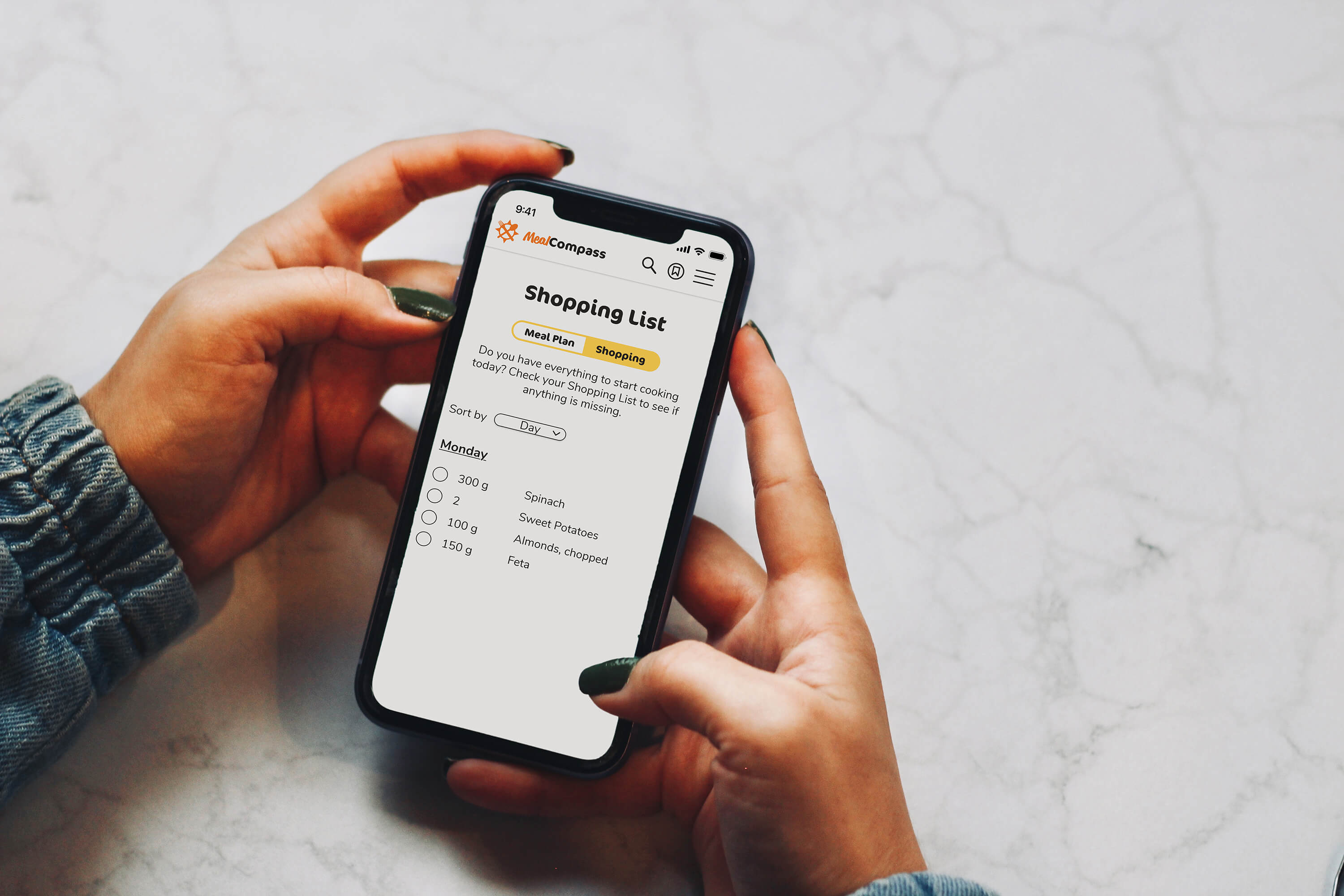
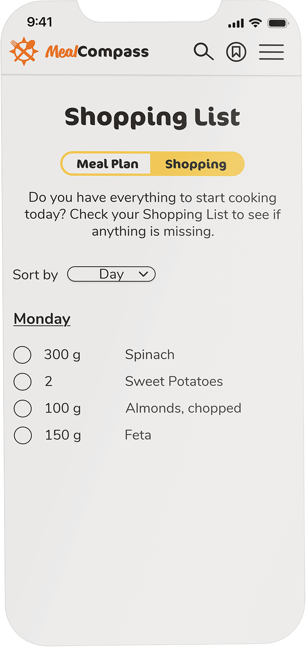
Effortlessly add ingredients from the meal plan to your shopping list and organize your grocery shopping with just a few clicks.
Try it!
What I've learned
Don't implement all ideas or possible features from the beginning
Having a bunch of ideas and solutions during brainstorming is great, but implementing them all from the beginning consumes valuable resources and time. Instead of striving for a single finished product, it is more beneficial to create a functional version of the product first (MVP), and then iterate on additional features after the initial launch. This approach not only helps in generating early profits that can be reinvested in further development but also allows you to gather valuable feedback and insights from users for subsequent iterations.
Don't design alone
While involving users in the design process is essential, it's equally important to engage with other stakeholders, such as colleagues, fellow designers, developers, or industry experts. Each of these individuals can provide valuable insights and suggestions to enhance my work. Another designer might offer a fresh perspective and valuable tips for improving my design, while a developer can assess the technical feasibility of my ideas. Receiving, and more importantly, accepting critiques is crucial for achieving a well-designed end product and should never be overlooked.
